The Spring 2027 Color Report: The 6 Exact Shades That Will Define Next Season
From electric hues to subdued tones, these six shades are set to define the spring 2027 color palette.

If there's one thing I've learned from studying the spring/summer 2027 runways, it's that designers aren't exactly interested in playing it safe when it comes to color. After seasons of quiet luxury, pared-back palettes, and an endless rotation of neutrals, fashion's collective mood is shifting toward something a little more expressive. And honestly, I'm not complaining.
From hypnotic shades of aquamarine and unapologetic red looks to unexpected, slightly offbeat hues that feel destined to become fashion-person favorites, next season's color palette is anything but predictable. That's not to say minimalists have been forgotten, either. Among the saturated offerings were soft, understated shades that prove making a statement doesn't always require turning up the volume.
After combing through the collections from New York, London, Milan, and Paris, I've narrowed down the six standout shades worth paying attention to for spring 2027. Whether you're ready to embrace color from head to toe or simply looking for a fresh way to update your wardrobe, consider this your official cheat sheet to the colors that will matter next season.
Psychedelic Aquamarine
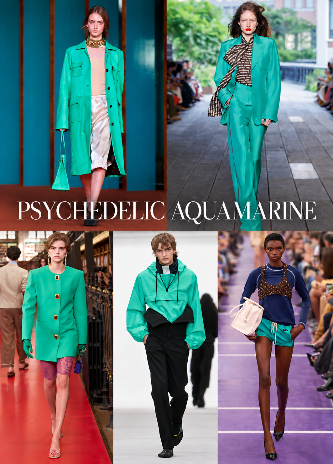
There's something undeniably hypnotic about this particular shade of blue-green. Somewhere between tropical turquoise and a particularly vivid aquamarine, the color made a compelling case for turning up the saturation come spring. Unlike the soft pastels we typically associate with warmer weather, this season's interpretation feels otherworldly—bold, surreal, and impossible to ignore.
Shop the Look
Подборка автора

Helsa
Helsa The Silk Charmuese Shirt
$288

PUMA
$85

Valentino Garavani
Valentino Garavani Devain Metallic Jacquard Top-Handle Bag
$2200
True Red
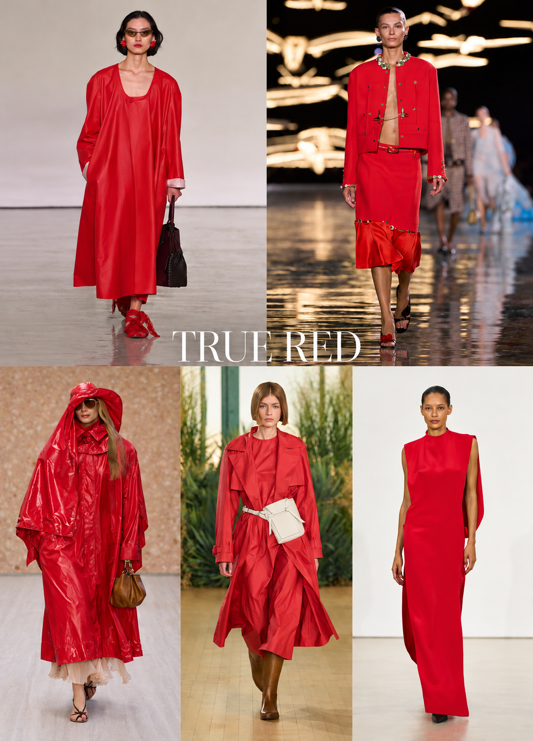
Red is hardly a groundbreaking proposition in fashion, but for spring 2027, designers are making a convincing argument for returning to the color in its purest form. Forget burgundy, oxblood, and the deeper, moodier shades that have dominated our wardrobes in recent seasons. This time around, it's all about true fire-engine red. Bright, assertive, and refreshingly uncomplicated, the shade commands attention without requiring much in the way of styling. Unlike pops of red dominating the trend cycle in the past, spring 2027's red involves a full look.
Shop the Look
Подборка автора


Yves Klein Blue

Some colors are practically impossible to separate from their cultural associations, and few are as instantly recognizable as Yves Klein blue. The intense, ultramarine-inspired shade has long occupied a special place at the intersection of art and fashion, and its electric presence feels relevant for spring 2027. Style it with stark white for a crisp and modern contrast, pair it with black for a more dramatic effect, or lean into the season's maximalist mood by introducing another bold hue.
Shop the Look
Подборка автора


Blood Orange

If there's one thing designers seem to agree on for spring, it's that subtlety isn't the goal. Case in point? The arrival of blood orange, a fiery, red-leaning shade that's somewhere between citrus and a late-summer sunset. Unlike the punchy tangerine and soft peach that have dominated previous seasons, this iteration feels richer, warmer, and decidedly more sophisticated. There's a retro quality to the color, especially when imagined in sleek separates, lightweight knits, and flowing dresses.
Shop the Look
Подборка автора


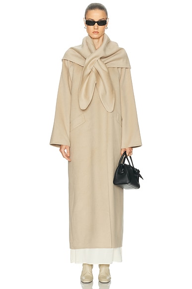
Barely-There Beige

For all the saturated colors making their way into the spring 2027 conversation, there's an equally compelling argument for exercising restraint. Enter the season's understated neutral: a soft, barely-there shade that falls somewhere between beige, sand, and pale taupe. Rather than the stark white or warm cream that usually dominate spring wardrobes, this hue offers something a little more nuanced. It's subtle without being boring, polished without feeling overly precious, and remarkably easy to incorporate into an existing wardrobe.
Shop the Look
Подборка автора


Dirty Martini Chartreuse

Not quite olive, not quite lime, and certainly not your average green, this season's chartreuse occupies a deliciously unconventional corner of the color spectrum. I'm nicknaming it dirty martini, and frankly, I can't think of a more fitting name. With its slightly murky yellow-green undertones, the shade has a peculiar sophistication that makes it feel more like an elevated neutral than a traditional statement color. The secret to pulling it off? Treat it as you would khaki or olive, pairing it with chocolate brown, ivory, charcoal, and other earthy tones.
Shop the Look
Подборка автора


